06 Analytics
General information on Analytics
In contrast to the SNH Classic, the various analytics functions have been combined into one overarching analytics module in Maltego Evidence. Since this module was developed from scratch, it is therefore still in an alpha phase, unlike the rest of Maltego Evidence. We would first like to receive more detailed user feedback in order to gradually optimize the Analytics.
Interface overview
| A | In the top bar you can organize your Analytics tabs. When you visit the Analytics module for the first time, a first tab is created automatically. You can create more tabs by clicking the plus icon. You can change the name of the tab by clicking on the pencil icon. With a click on the remove icon, you can remove the tab. If you remove the last tab that is left in this project, a new empty new tab will open automatically. By clicking on the downward looking arrow to the left of the tab name, you can restore past saves of that tab. | |
| B | By clicking on "Initialize with target profiles", you can load the target profiles of the project into Analytics. If the target profiles have connections to each other, they will already be displayed. Friends of the target profiles are not yet displayed at this point. If there is already other data in the view, it will be removed and the tab will be reinitialized with the target profiles. If the target profiles are part of an account linking, the account linkings are displayed as separate nodes with links to the contained users. However, not all users of the account linking are automatically displayed, but only those that have been marked as target profiles. | |
| C | By clicking the "Initialize with all profiles and connections" button you get a view similar to the network analysis module of the SNH Classic. All profiles contained in the project from each network are loaded. By default, a minimum number of connections is selected so that the render process can go through efficiently. See also item "P" for a detailed explanation. The profile images are hidden and instead the nodes are displayed as colored dots whose color gives an indication of membership in a computed "community". See item "R". If you want to manually select the minimum number of connections per node in advance, you can click on the arrow to the right of the button and select the corresponding menu item in the dropdown. A popup will open where you can specify the minimum number. Please keep in mind that especially for large projects (> 10k nodes) the loading of the data may take a few seconds. This will be indicated to you by means of a loading symbol at the top center. In rare cases, one of your runners will be used to calculate the nodes and links. So if the process of loading takes a long time, please make sure that not all runners are occupied by a large amount of survey jobs. However, in normal cases, this should not be a problem. | |
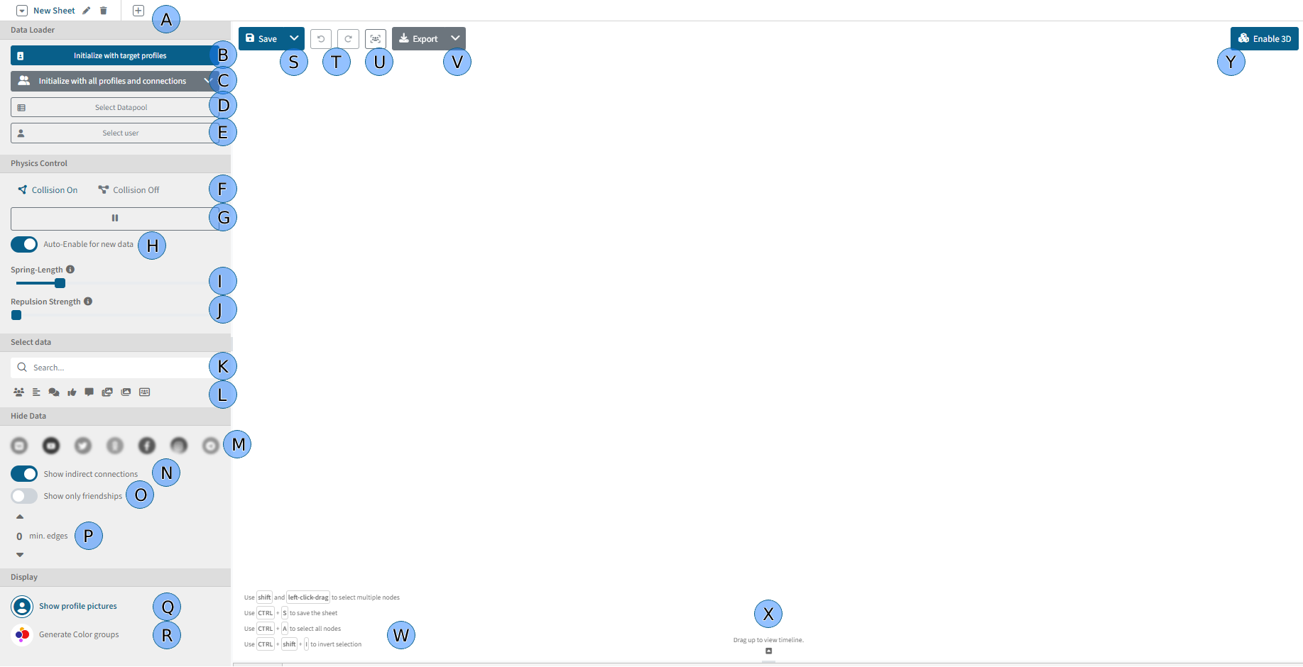
| D | Using the "Select datapool" button, you can select all data within a data pool and add them to Analytics. If you have already created data pools within the project, you will be offered the choice between the 4 main data types when you click on the button. This will then contain all data pools for selection. Clicking on a data pool loads the data into the view. | 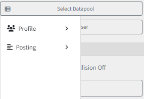 |
| E | Via the "Select user" button , you can load individual users into the view. The profile explorer opens in a popup. There you can either directly select a target profile on the right side or search for a specific user in the table. We would like to give a short hint here that it is also possible to add data to Analytics via the explorer. | |
| F | In the Physics category you can influence the physics of the displayed nodes. This will help you to display the data better. The switch-button "Collision On" / "Collision Off" has the biggest influence on the display style. "Collision On" ensures that each node tries to get enough space to be clearly visible. This is useful if you have a small amount of nodes in the scene. The nodes spread out at the expense of a uniform length of links. "Collision Off" results in nodes no longer primarily trying to make room for themselves, but instead the graph creates as uniform an overall appearance as possible. A uniform link length is preferred. This is especially useful for a larger number of nodes and connections. | |
| G | With the Play / Pause button you can pause or resume any physics simulation. Please also note point H, if physics simulations start again and again despite pausing. | |
| H | The checkbox "Enable physics on new data" automatically continues the physics simulation when new data is loaded, for example when opening the tab after the next save, or when expanding certain nodes. If this option is unchecked and you expand contents of a node (e.g. its friends), it may happen that all new profiles are loaded at the same position and thus overlap. We therefore recommend that you leave this checkbox checked as a rule. | |
| I | The length of the links affects how far nodes that are connected "bounce" off each other. It is recommended that as the number of nodes and connections increases, you move the slider to the right to keep track of them. In general, it is recommended to make this slider an active part of your work with graphs. It significantly influences the clarity. | |
| J | The strength of displacement affects how hard a node tries to free itself and displace other nodes. | |
| K | Using the search field, you can search for data within the graph. The search is always based on the displayed title of the node. All found nodes are selected in the view and highlighted by a thick red frame. If you remove the content of the search field, the data will be deselected. | |
| L | Using the type selection you can select nodes of the selected type. If no nodes are currently selected, all nodes of the selected type are selected. If a single node is currently selected, all adjacent nodes of the selected type are selected. If multiple nodes are selected, the nodes in the existing selection that have the selected type are selected. | |
| M | You can flexibly hide data or display it again. For example, you can hide or display data from different networks. A blurred network icon means that there is no data from the network in the view yet. Therefore, no data can be hidden either. A clear, colored network icon means that data from the network is available and can be displayed. By clicking on the icon, you can gray out the icon and thus hide the data from the network. With another click, you can show the data again. Please note that this function does not load any new data, but only shows or hides data that has already been loaded. | |
| N | You can hide indirect connections between users. This means that only direct connections are displayed. This includes, for example, the connection between a profile and its posts and between reactions and the profiles giving the reactions. If two users are connected via a reaction, no connection between the two users would be displayed if the indirect connection is hidden. With hidden indirect connections, friendships of type "Friendship" are also hidden. | |
| O | If you still want to display friendships of the type "Friendship" or "Follower", but want to hide all other connections, like a reaction connection or comment connection, then activate the indirect connections under point N, but filter the connections by activating point O. This way only friendships will be displayed. | |
| P | Filtering by the minimum number of connections can be used to hide nodes that do not have at least the specified number of connections. This includes incoming as well as outgoing connections. When changing the value, the data is calculated once. This can take up to a few seconds depending on the amount of data. The data is not completely removed from the view, but only hidden. So if you lower the minimum number again, the hidden nodes will be displayed again. | |
| Q | By means of the node visualization you can decide how nodes are to be displayed. For small amounts of data, it can be useful to display the profile images of the profiles. To do this, select "Show profile images". | |
| R | For large amounts of data, the display is automatically switched to colored nodes. However, you can also do this manually by clicking on this button. The color depends on the calculated "community" membership. For this, the Louvain algorithm is used to automatically identify node groups. It is important to note that this algorithm only approximates the groups. Thus, the generated color groups do not necessarily correlate with real group structures. It only serves as an approximation and visualization aid. | |
| S | The important thing is that you need to save your progress regularly. To do this, click on the "Save" button at the top left. This will save the progress in the currently opened tab. When you switch tabs, make sure you have saved the changes in the current tab. When you save your changes, the data is not overwritten, but a new save state is added for the tab, i.e. you can also switch to old states of the tab. See point A for this. | |
| T | You can undo changes made, similar to what you are used to in other software. Please note that position changes of individual nodes are not considered as actions here. Changes in the display options on the left side are considered as reversible actions. | |
| U | By clicking the Focus button, you can bring all visible nodes into the current view. | |
| V | You can use the Export button to export the current view as a SVG image. With a direct click on the button the view will be saved as an SVG. Depending on the size, a save dialog will appear after a few seconds to select the location where the SVG should be saved. With a click on the dropdown arrow on the right side of the export button, you can add the current state of the graph to the report builder and include it in your PDF export. There you will also see further options, such as whether the profiles displayed in the graph should also be exported as a table. The graph will then be included in the PDF as a vector graphic. In contrast to SNH Classic, you can now also export an exploratory analysis with postings, reactions, etc. as a PDF/SVG. | |
| W | Here you will see a few keyboard shortcuts that may be helpful when using the Analytics module. | |
| X | Dragging the bottom pane up opens the Timeline view, which displays posts, media items, comments, and chat messages on a timeline. | |
| Y | As a new feature we have added a 3D visualization. You can view the current data as a 3D visualization by clicking on this button. However, it is important to note that this feature is only a first implementation. All displayed elements are shown as a sphere shape (also postings, etc.) and saving the tab does not save the current state of the 3D visualization. The 3D representation always recalculates itself with a click on the button. | |
Interactions within the interface
You can flexibly interact with the already displayed data and use functions on the selected data. To do this, either select a set of nodes first and then right-click on the surface, or right-click directly on a specific node without selection. A context menu opens with several executable expansion options.
The actions are briefly presented below:
 | A | Opens a sidebar with a detail view of the selected item, if a detail view is available. Available for posts, profiles, chat messages, and media items. |
| B | Updates the expected number of elements shown in gray boxes | |
| C | Fixes the node at the specified position and excludes it from the physics simulation. | |
| D | Inverts the current selection. This means that all currently unselected objects are selected and all currently selected objects are deselected. | |
| E | Removes the selected nodes from Analytics. | |
| F | The overview of actions available for the selected nodes. If several nodes of different types are selected, not every action is always relevant for all selected nodes. For example, if posts and users are selected, the "Expand all friends" function applies only to the selected users. |
My Analytics is not automatically updated with the new data?
It is important to emphasize that an Analytics status is always only a representation of the actual state at the time the graph was created. I.e. if you initially load target profiles, save the sheet and open it again later, then all profiles marked as target profiles in the meantime will not be displayed. Only the original state will be displayed.
However, the expansion options always handle the latest data. You can, for example, simply expand a user's friends again at a later time to ensure the completeness of the friend display in Analytics.
Alternatively, if you have added more users to an account linking, this will not be updated in existing Analytics sheets. This is intentionally designed so that your Analytics content persistently reflects a particular state of discovery. Should you wish to update the contained users within an account linking in your Analytics, you can simply right-click on the account linking and expand the contained users. Since expansion operations always act on the latest data, the updated account linking user list will be loaded.
Can I tag data or create a data pool in Analytics?
Currently, this is not yet possible. However, this feature is on the roadmap.